
behavioral ux | mobile banking · ios
Demystifying Financial Data
A redesign of the financial analytics experience for Astra Capital. Built around the idea that data should answer a question, not create one.
my role: product designer
platform: iOS
focus: financial insight systems and behavioral ux
overview
a banking app that closes the gap
Astra Capital is a concept project built around a real frustration: most banking apps show you data without telling you what it means. This case study covers the Insights & Analytics flow. The feature designed to close that gap, and turn numbers into something worth acting on.
the problem
the data is there, the meaning isn't
Most banking apps show you numbers. Balances, transactions, maybe a bar chart. None of it answers the question people actually open the app to ask: am I making progress? Without that answer, it's just noise. Users open the app, feel vaguely stressed, and close it. The interface works. The experience doesn't.
80% of Americans report financial anxiety
54% feel stressed about money at least 3 days a week
33% have deleted a banking app over bad UX
People aren't confused by their finances. They're confused by the tools.
user research
ten conversations, two patterns
I spoke with ten adults who have savings goals but feel disconnected from their financial data. Different ages, different incomes, same friction. Two findings came up in every single conversation.
checking in doesn't mean feeling informed
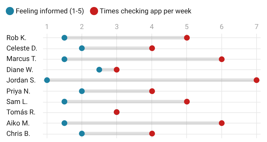
Participants checked their banking app an average of 4.7 times a week. When asked how informed they felt after opening it, the average score was 1.85 out of 5. The habit is there. The payoff isn't. People aren't disengaged. They're showing up constantly and walking away with nothing. That gap between frequency and feeling is where the design problem lives.
One participant put it plainly: "I want to know if I'm winning." They checked their app five times that week and still couldn't answer that question.
users know what they need, apps aren't delivering it
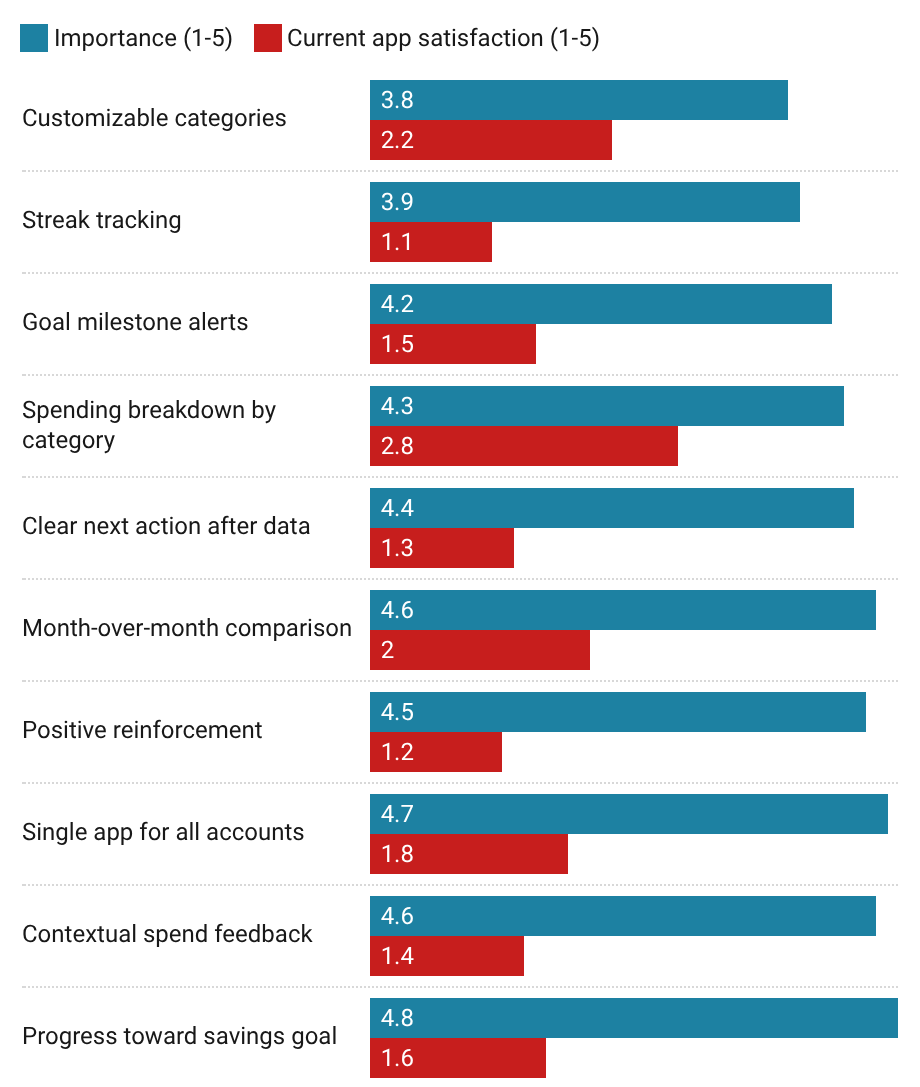
When asked to rate the importance of ten specific features, participants averaged 4.4 out of 5. When asked how well their current app delivered on those same needs, the average dropped to 1.69. Every single feature was underserved. The most wanted ones, progress toward savings goals, positive reinforcement, a single view across accounts, scored the lowest on satisfaction.
"I have three apps and none of them talk to each other," one participant said. "I'm the one doing the math in my head." That came up in eight out of ten conversations. Users aren't asking for more. They're asking for what's already promised to actually work.
persona
who i designed for
Alex Morgan · 28 · school secretary · portland, me (passive saver)
on checking the app
"I check my balance constantly but I still have no idea if I'm actually making progress toward anything."
on goal tracking
"I don't want to think about money too much, it stresses me out. But I also don't know if what I'm doing is working."
on what good would look like
“I wish someone would just tell me if I'm okay or not."
when progress is invisible, users stop believing it's happening
frustrations
1. data with no explanation
2. can't tell if a month was good or bad without doing the math himself
3. good months go completely unnoticed
4. spending categories that don't reflect how he actually lives
goals
1. know where his money is going without hunting for it
2. feel good when he opens the app, not just stressed
3. save toward something real
4. hear about it when he's doing well, not only when something's wrong
behaviors
1. checks the app 4-5x a week, rarely gets past the balance
2. everything lives on his phone
3. motivated by streaks and visible progress
4. loses interest if something takes too many taps
empathy
1. anxious when opening the app unexpectedly
2. relieved when the balance looks okay, but still unsure
3. invisible when a good month goes unacknowledged
4. proud when hitting a milestone
process
three rules, every screen
1: win first
Show the user they're succeeding before asking them to do anything. The overview leads with progress, not problems. If the first thing you see when you open the app is a warning, you close the app.
2: earn the detail
Category breakdowns are one deliberate tap away, never front and center. Users who want to dig in can. Those who don't aren't overwhelmed. Progressive disclosure isn't a UX term here. It's the entire point.
3: action over information
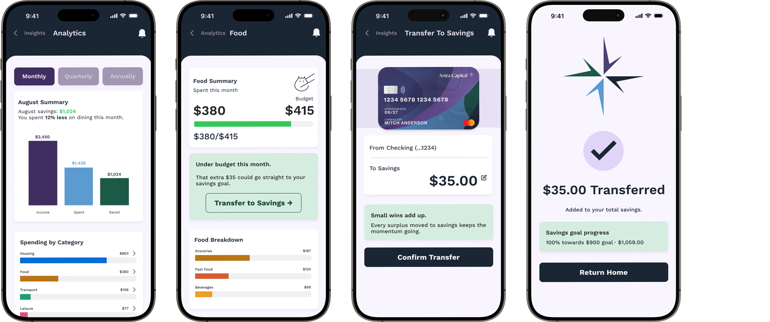
Every screen surfaces one clear next step. Not just what happened, but what to do about it. The analytics don't end with a chart. They end with an offer.
sitemap and wireframes
thinking before building
sitemap
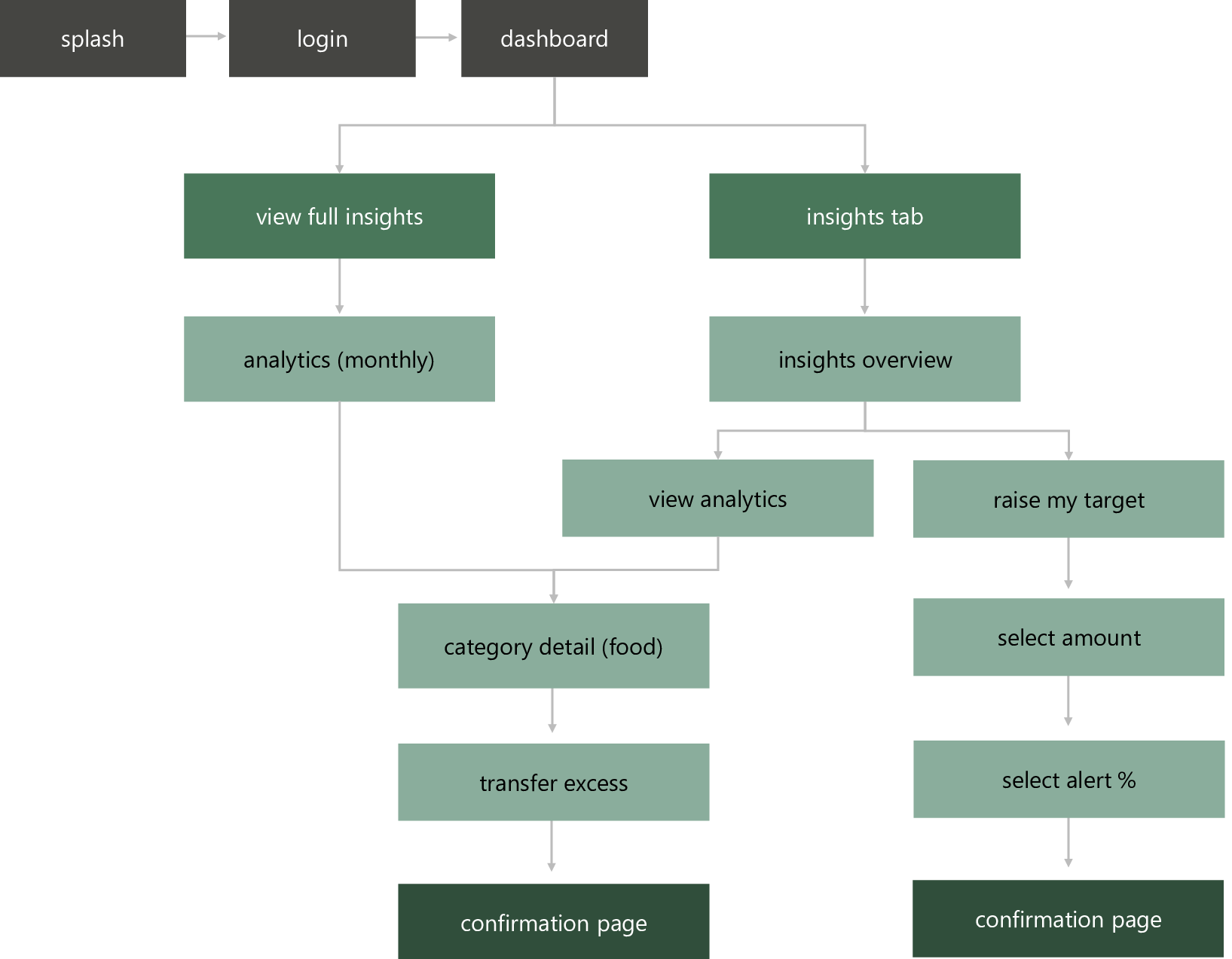
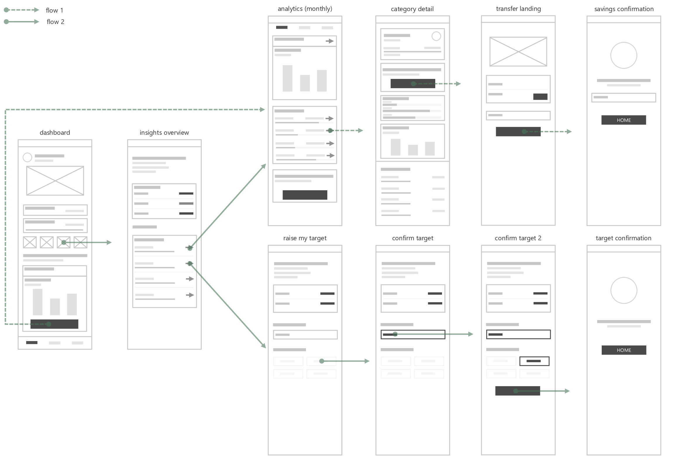
Two paths through the Insights section, each driven by a different user intent. The direct path drops you straight into data. The insights path earns the data first.
wireframes
Early frames focused on information hierarchy and the emotional sequence of each screen. What does the user see first, what does it ask of them, and where does it leave them.
screens
first impression
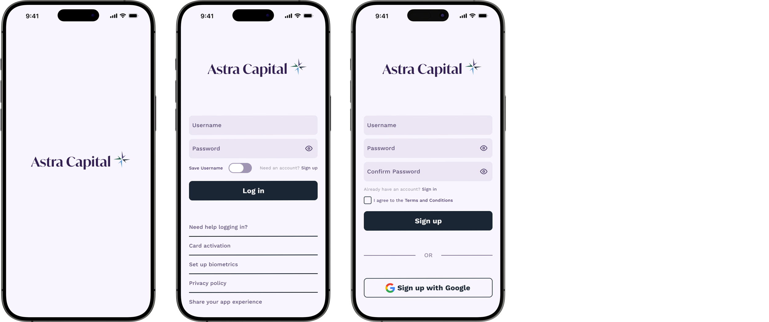
Splash, login, sign up. No friction, no feature push. The entry point earns trust before it asks for anything.
a banking app that tells you if you're winning
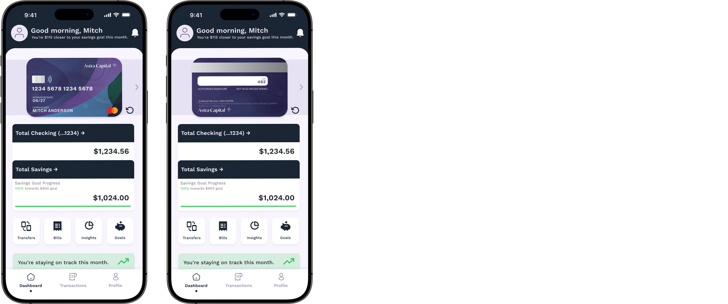
everything that matters, the moment you open the app
Card front and back, checking and savings, goal progress bar, and four quick actions. You're staying on track this month.
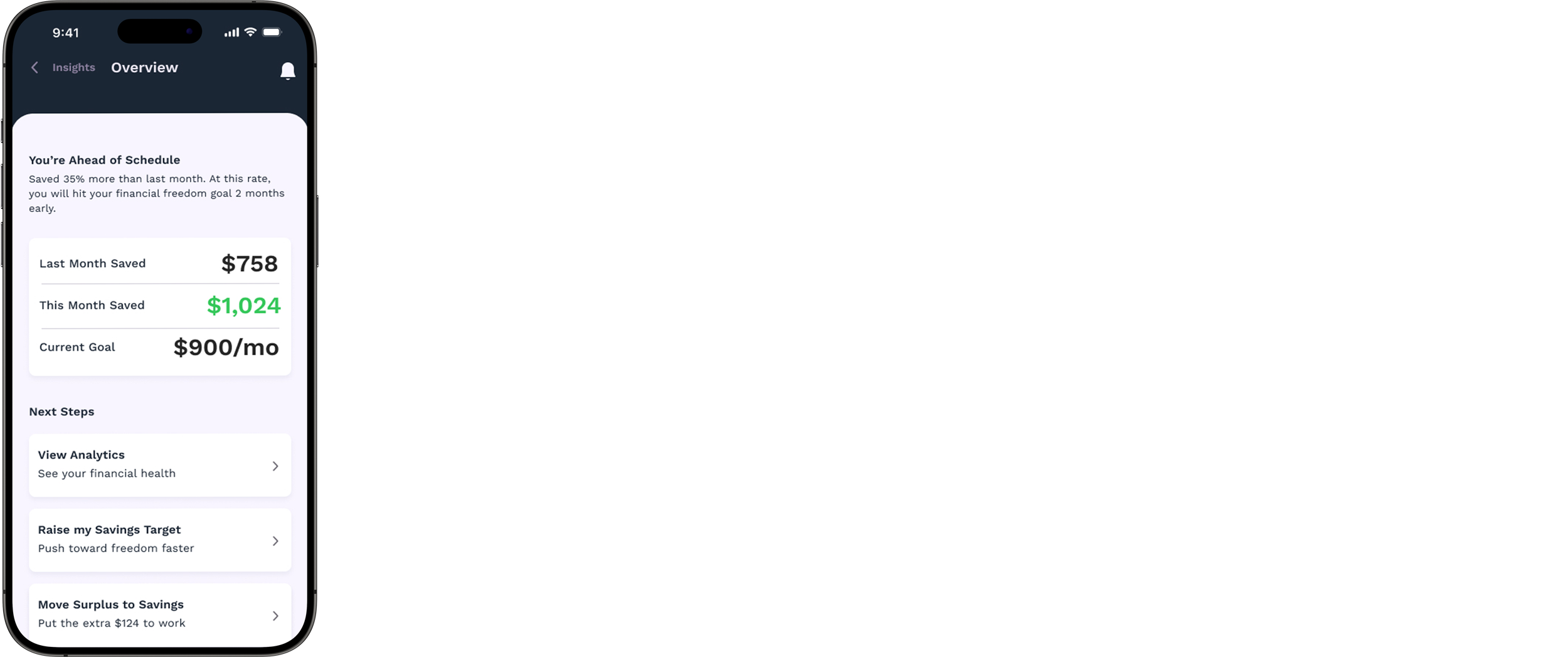
insights overview
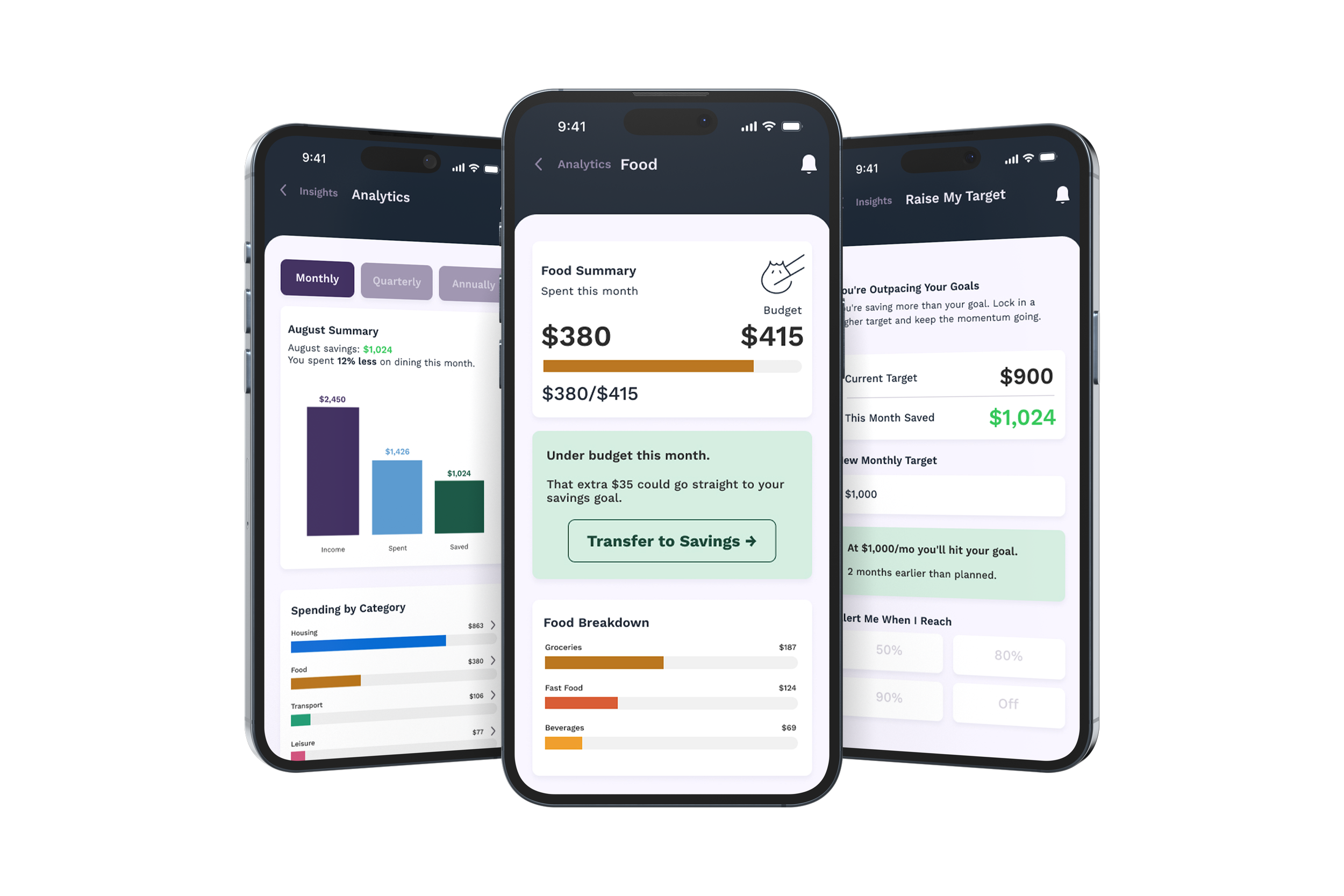
You're ahead of schedule. Last month $758, this month $1,024, goal $900/mo. Three next steps. You pick the depth.
monthly spend, made actionable
Income, spent, saved. Then category by category. Food: $380 against a $415 budget. Under budget. The app tells you what to do next.
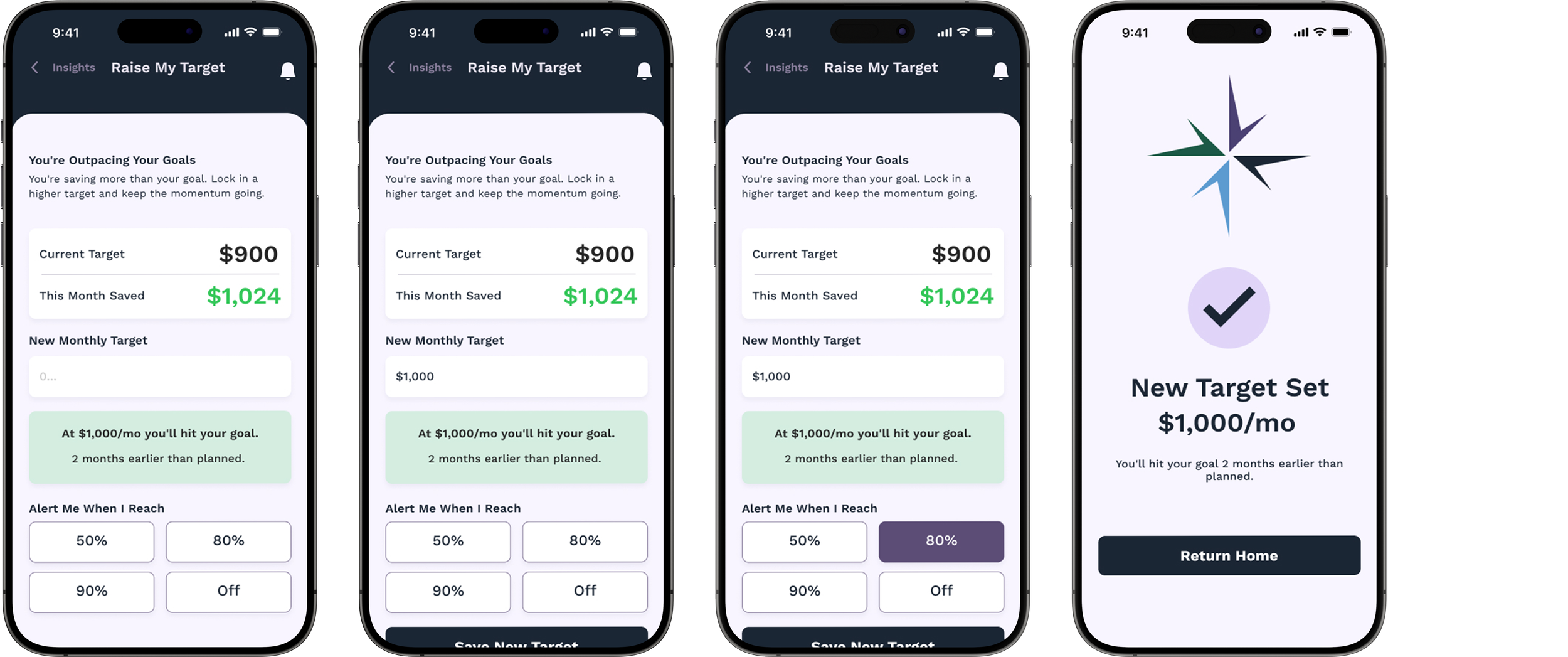
outpacing your goal? raise the bar
Current target $900, this month $1,024. Enter a new number, see the updated timeline, set an alert. Done.
outcomes
what i learned building for financial anxiety
user empathy
Financial anxiety is specific. It shows up in the half-second before the app loads, in the relief when the balance looks okay, in the guilt when it doesn't. Designing for it meant understanding that feeling first, then building around it.
ux writing
Copy is structural, not decorative. "Under budget this month" is a data point. "That extra $35 could go toward your savings goal" is a reason to act. That distinction drove most of the decisions on this project.
data visualization
The charts in the research section exist because two interviews feel anecdotal and ten feel like a pattern. The analytics screens exist because a wall of transactions doesn't tell you if you're winning. Data only works when it's shaped around a question someone is actually asking.