
watchOS · product design
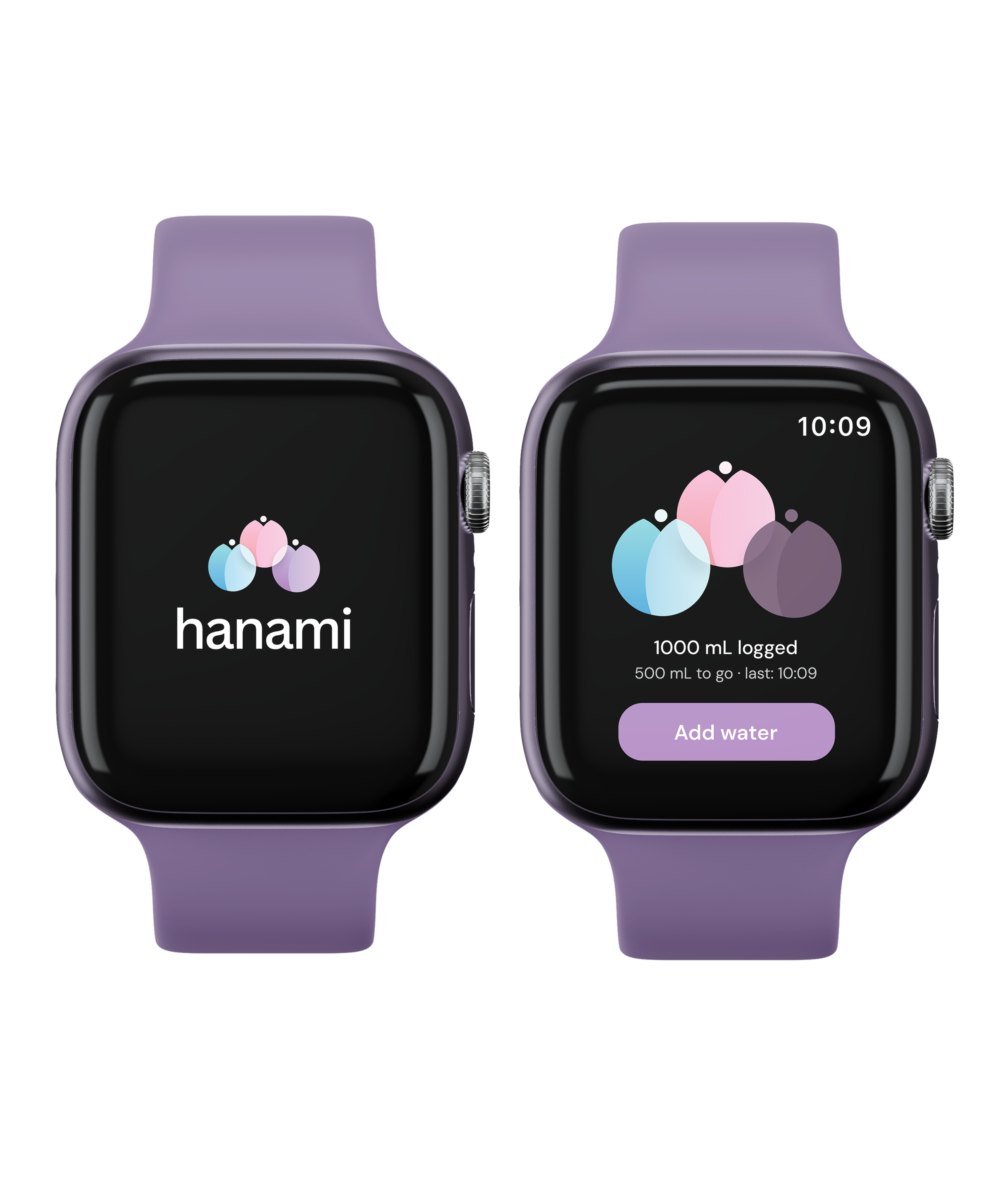
Visualized Hydration Logging
Three bulbs. One goal. No math required.
my role: product designer
platform: watchOS
focus: glanceable design and interaction systems
overview
progress should feel like something
Hanami is a hydration tracker for Apple Watch. Not a dashboard. Three flower bulbs that bloom as you drink. You know where you stand before you've finished reading.
the problem
water trackers track, they don't communicate
Most apps give you a number. A ring. A percentage. None of it lands in a glance.
69% of fitness and nutrition apps are abandoned within 90 days
35% of young adults meet the National Academy of Medicine's recommended daily water intake
The wrist isn't the right place for data. It's the right place for a feeling.
user research
four conversations, one gap
I spoke with four Apple Watch users already trying to track their water. All four had an app. All four had a goal. None of them felt like it was working.
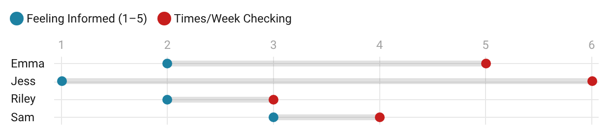
They checked their apps an average of 4.5 times a week. When asked how informed they felt after opening it, the average was 2 out of 5. Checking wasn't the problem. Feeling something after wasn't happening.
Three out of four said they wanted one glance to tell them if they were on track. No metrics or charts, just an answer.
process
three bulbs, one story
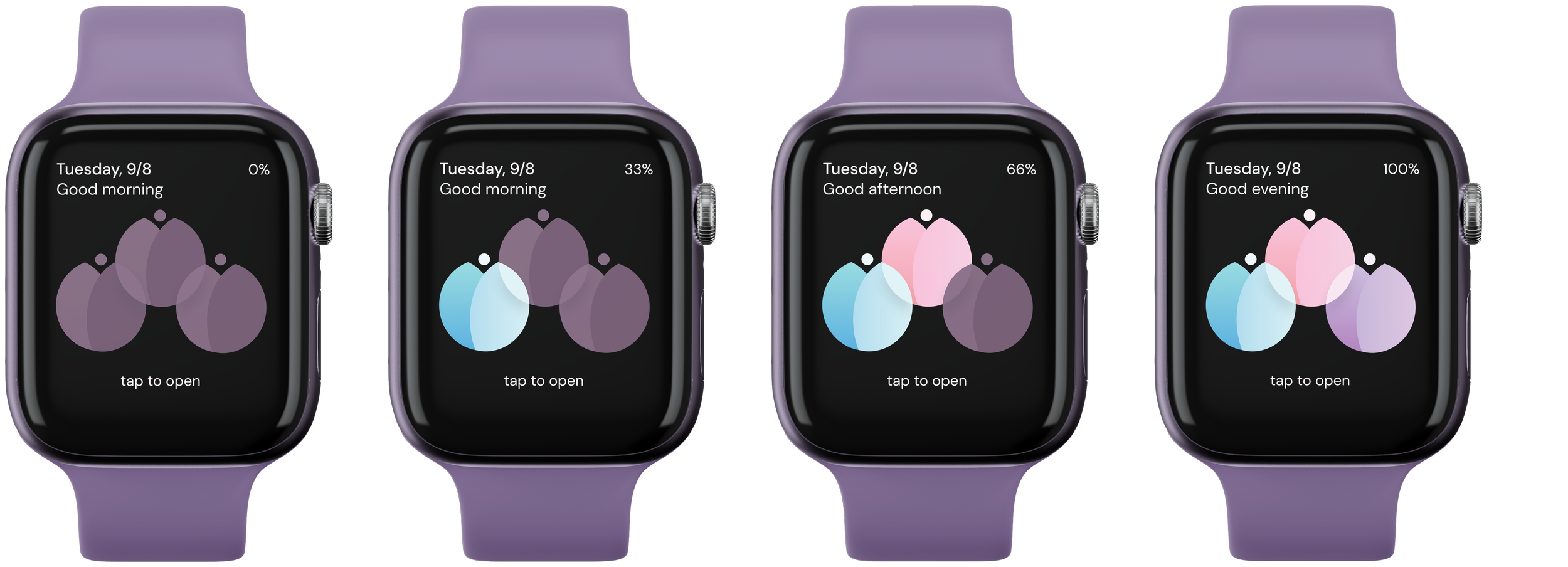
Each bulb is a third of your goal. Dormant at zero. Blue at one third. Pink at two. All three in full bloom when you're done.
Minimal metrics on the watch face. You either see a garden or you don't.
The same logic runs through every screen. The button color tracks your progress. The confirmation bloom fills the display. The system always knows where you are, and shows you, not tells you.
wireframes
mapping the moments that matter
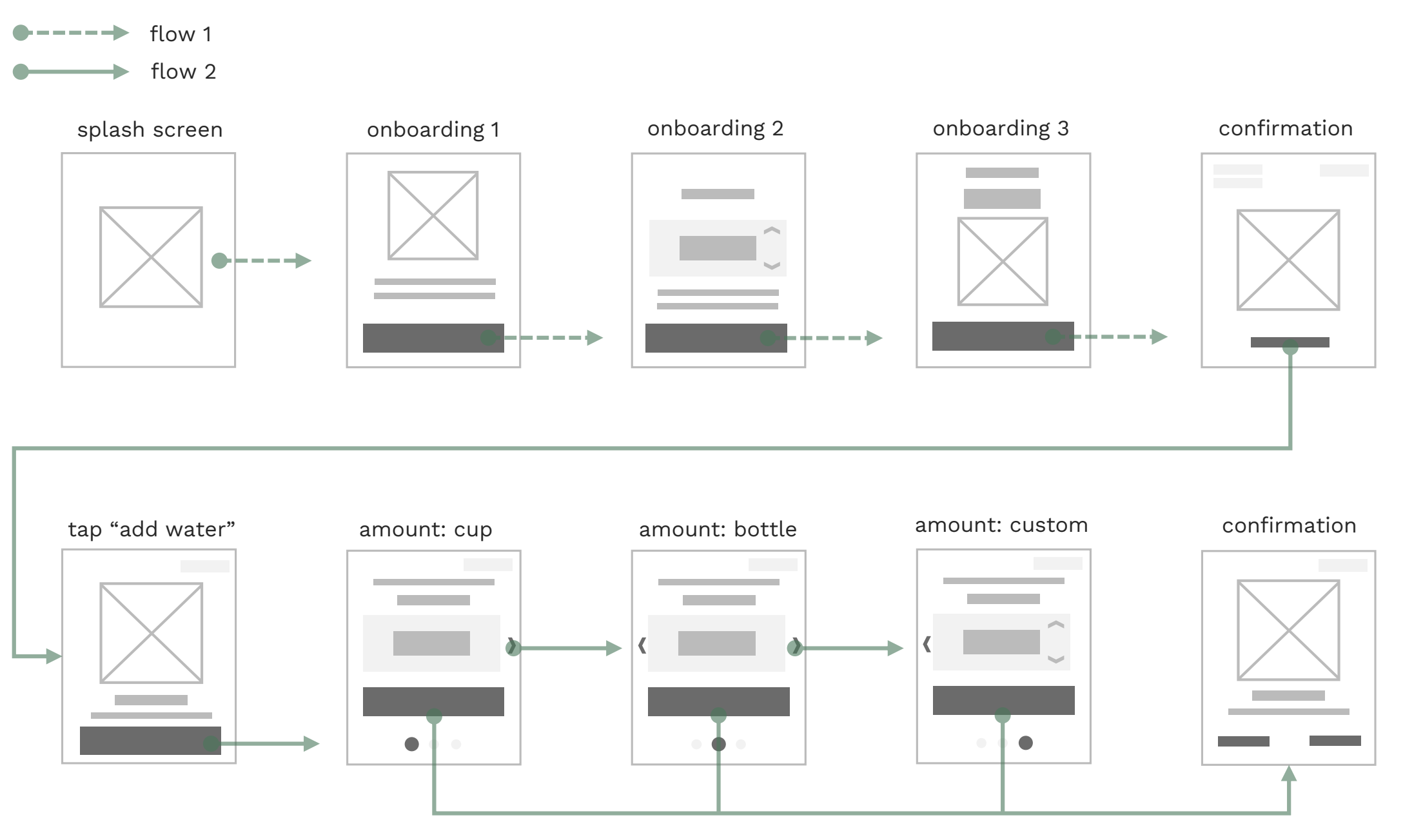
Two flows. Onboarding and the core loop.
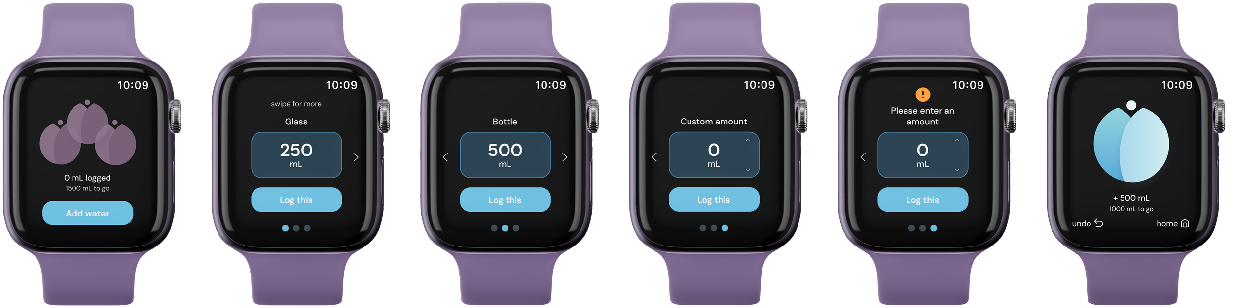
Onboarding runs once. Splash, three steps, done. The core loop is what happens every day. Tap to add water, pick a vessel, confirm. Cup, bottle, and custom all land on the same screen.
The only edge case worth solving here was custom amount. Crown scroll, no extra screen.
screens
what you see is what you know
splash screen
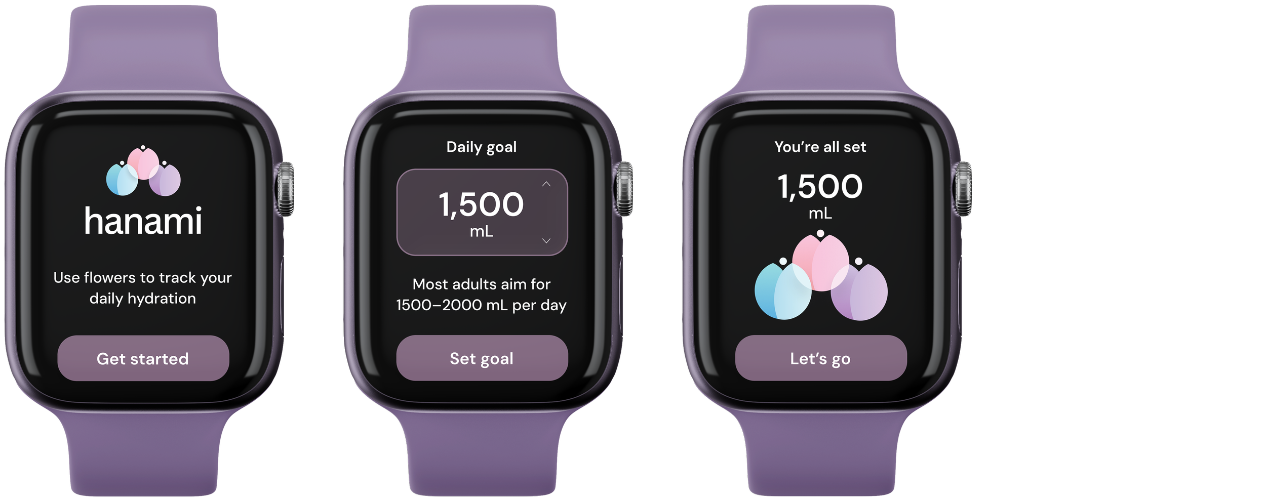
Logo, name, nothing else. The three bulbs appear in full color before a single interaction happens. The system is already telling you how it works.
onboarding
Three screens. Concept, goal, confirmation. The crown-scroll input here is the same one used to log water later. Consistent before the core loop even starts.
home screen
Bulbs are the hero, not metrics. Dormant at zero. One bulb by morning, two by afternoon, all three by evening. The greeting shifts with the time of day. You know where you are before you've read anything.
add water
One vessel, one number, one button. Swipe to move between options. The card and button color match wherever you are in your day. Custom amount uses chevrons instead of swiping. Different input for a different kind of decision. Logging ends on the bloom. The display clears. Two bulbs fill it.
outcomes
what i learned building for the wrist
glanceability
Every decision ran through one question: does this land in under two seconds. When the answer was no, something got cut.
color as behavior
The button tracks progress. The bloom fills the display. Color didn’t act as finish but structure.
small screen, hard decisions
WatchOS has no room for hedging. Designing for it meant getting specific about what Hanami was and what it wasn't. That clarity only came from the constraint.